Color... it'll make you or break your work. I don't know about you, but I struggle in this area a lot. I find a great tube or picture I want to use it in my designs, and then try my hardest to find contrasting colors to make it pop off the page... and end up disappointed.
I questioned if I even had the knack anymore. I know what looks good and what doesn't, but I didn't know why. I was fine if I copied someone else's color scheme, but doing one of my own? I kept hoping I'd just magically find the colors that would make my pages look breathtaking, but have come up empty handed until I discovered the color wheel.
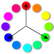
Colors actually have relationships. When Sir Issac Newton figured out how to put the colors in this fancy wheel, he made a huge break-through.
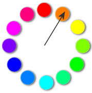
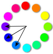
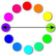
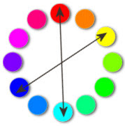
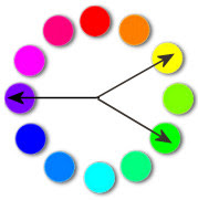
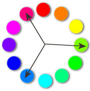
So, there's a few ways you can mix colors together.
http://www.color-wheel-pro.com/
So, I hope it'll help steer you in the right direction of what colors to pick and avoid in your design!
To your design success,





0 awesome fan comments:
Post a Comment